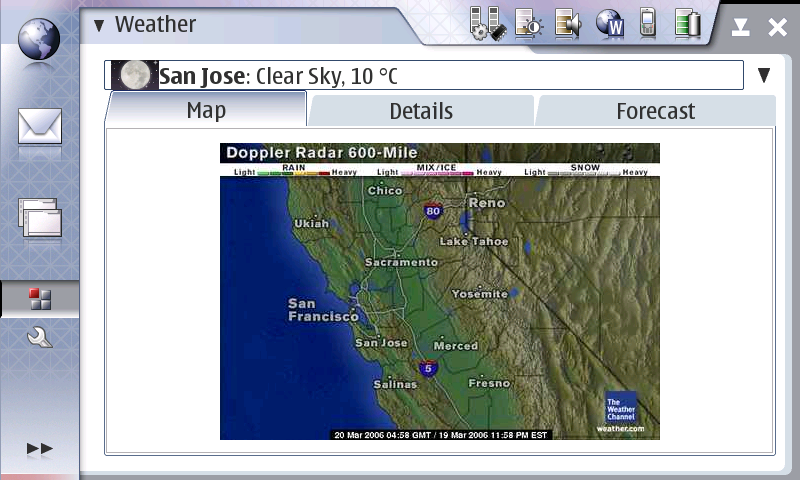
Kalle made a very good point about the problems with the two pane view, I have what I hope is a better idea that still avoids additional dialogs. It’s actually inspired by me accidentally using a VBox instead of the HBox in the original prototype. As you can see below, I’ve moved the location list into a ComboBox, which increases the amount of space available for details/map/etc in both directions, while keeping it possible to see the summaries of all the locations with just one additional click – not a bad compromise.
The only annoying thing is that the ComboBox doesn’t grow to fit the row size; you can see that the icon is vertically clipped. I’m now sure why that’s happening, but I’ll either have to manually increase the size or use a smaller icon.
{ 1 } Comments